Building The Grade Guide
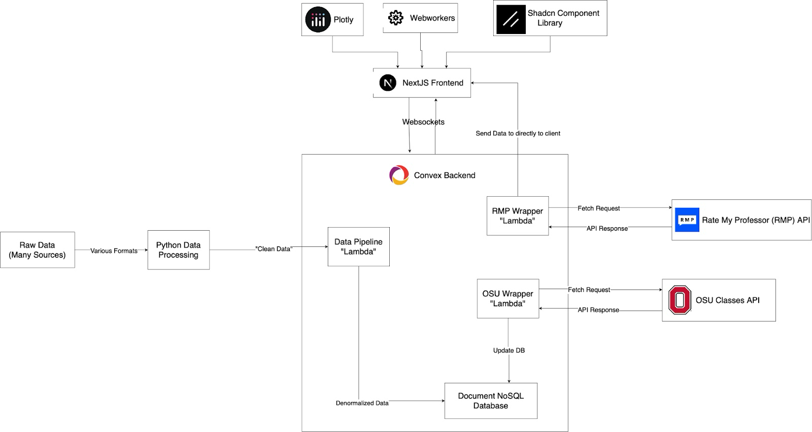
 The Grade Guide's Architecture
Why I'm Making This
Around this time last year, I launched the first public version of TheGradeGuide.com. Now that I'm about done with this project, I wanted to share the journey of why and how I made this site! My goal with this writeup is to reflect on my wins and mistakes while making this and to inspire other students to create their own Grade Guides for their colleges.
Part 1: Building the Dataset
Realizing Grade Guide was Possible
I was sitting in my data structures and algorithms class when my friend showed me GradeTier: a site that showed anonymized past grade distributions for OSU class. I found this more interesting than learning about the Ford-Fulkerson algorithm and started down a rabbit hole. I began investigating how they got the data and found two reddit posts: one about GradeTier and one about OSUProfs (student survey result site). I then started wondering if there was a way to combine these sites to figure out which professors give the best grades
Acquiring The Data
I started my investigation by sending a Reddit DM to the account the created the GradeTier post asking about how they sourced the data. They directed me to The Ohio Public Records Act, which prompted me to email Ohio State's Public Records Division asking for grade distribution data by professor. Unfortunately I was denied under the Federal Family Educational Rights and Privacy Act (FERPA). However, I found that requesting for anonymized grade distribution data and student survey results for professors separately was compliant.
Making the Data Useful
The first set of data I received was a excel sheet of anonymized grade distributions by class. The shape of the (messy) data was roughly as follows:
Cleaned_Excel_Row = {
  Term_Code,
  Campus,
  Subject,
  Catalog,
  Class_Number,
  Title,
  Total_Students,
  A_Count,
  A_Minus_Count,
  ...
  E_Count,
}
While I was waiting for the student survey data I spent my time cleaning up the Excel sheet into a clean csv with Pandas. I also noticed that the "Class_Number" seemed to be a unique identifier (at least for the semester) for a class and was shown to students in Canvas.
Eventually I received an (also messy) Excel sheet for the student survey data1 with the below shape:
Cleaned_Excel_Row = {
  Last_Name,
  First_Name,
  Subject,
  Catalog,
  Class_Number,
  Term,
  SEI_Responses,
  SEI_Rating,
}
Right away I noticed that each dataset has 4 matching keys: Subject (ex. MATH), Catalog (ex. 3341), Class Number (ex. 13169) and Term/Term Code (ex. "Fall 2020"/1242). I then opened up Pandas and looked to see whether this data could join together and if it was accurate. I discovered 3 things:
- Many classes have grade distributions but no student survey results
- Some classes have survey results but no grade distributions
- Classes with multiple parts (ex. lecture, lab, recitation) didn't always have their (Canvas) Class_Code in the grade distribution excel
After some manual verification and email exchanges with the public records office I made the following discoveries:
- Survey results for PhD or Masters students were intentionally excluded by OSU due to FERPA
- Grade Distributions for classes with under 10 students were also intentionally excluded by due to FERPA
- For classes with multiple parts (ex. lecture, lab, recitation), each part will have its own class code with only one used in the grade distribution excel
I then had to make some tradeoffs with how I joined the data: use grade distributions as a source of truth (left join), use student surveys as a source of truth (right join), keep all the data with missing gaps on either side (outer join). I decided that the grade distributions were the most important data to me and that I didn't care about survey results on their own, so I chose to do a left join. This led to a dataset that had grade distributions for every class taught for the past 5 years with student survey results (and professor info) if it existed.
Part 2: From Notebook to Website
 Early version of Grade Guide
Grade Guide v0: The Prequel
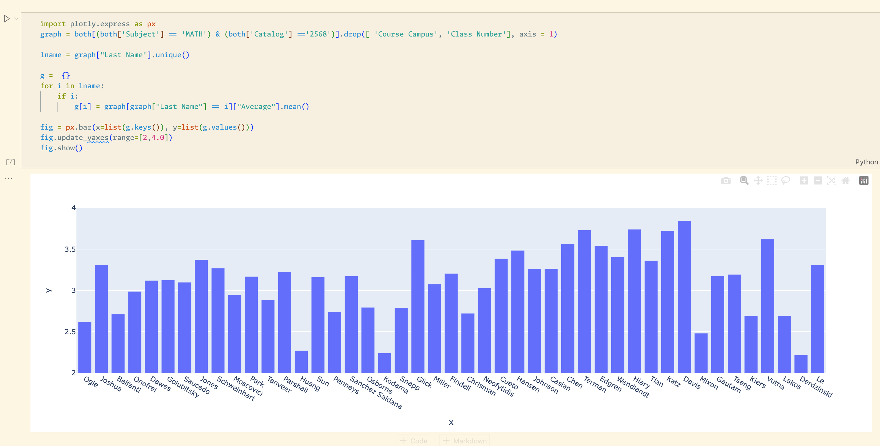
By the time Autumn scheduling came around, I was determined to leverage (at the time) personal dataset to help me schedule classes. As Javascript scared me at the time, I whipped up a quick jupyter notebook and made some Plotly charts. The notebook had 3 main uses:
- See past instances of a class being taught and a bar graph showing how many As, Bs, Cs, etc for each
- See a bar graph of the average GPAs for a class by which professors taught it (shown in pic above)
- See a bar graph on how what grades a professor gives based on which classes they teach
At this point I was likely the only student who knew that it was possible to compare classes and professors based on historical grade data at Ohio State, so I felt like a wizard whenever I showed it to my friends. Eventually, I started getting enough requests where I began considering making Grade Guide a site and monetizing.
Grade Guide v0.5: An Over-engineered Mess
When I officially decided I wanted to make Grade Guide a website, I had two major roadblocks: I knew nothing about how to make a website and I also disliked UI/UX design. This made my attempts at making a webapp that met my standards tricky.
I ended up putting Grade Guide on hold until I got back from my internship at Amazon where I did full stack web dev (and conquered my fear of Javascript in the process). Once I got back I had both the knowledge of how to make the Grade Guide and the motivation to grind out building it solo (I was pretty bored at the time).
My approach to making Grade Guide was to start by modeling what kind of data views I wanted to see, and then making a fronted to show the data in nice to use way. This let me focus on function instead of spending my time making mockups. I was optimizing for developer speed and ended up choosing Convex as a BaaS platform since I had a poor experience in the past with Firebase and also got good vibes from one of the company representatives from a past Hackathon I attended. I also decided to use the Next.js with the NextUI component library for the frontend.
Working with Convex was easy, in fact I would argue it was a bit too easy. After adding the core functionality to the site, I added a login, then reviews, and then upvotes/downvotes on the reviews. I would likely have kept adding new features (namely the ability to upload study materials to a class) to the site until I started sending early versions of my site to friends. Once I heard their feedback and saw them using it, I realized a lot of these extra features were distracting from Grade Guides core purpose: informing students with data, not opinions. I then began to work on stripping away everything but the core functionality.
Grade Guide v0.75: Turns Out UI Mattered
For the next version of Grade Guide, I spent the majority of my time on website polish and providing new insights on the data I had. I also added Google Analytics as I needed a way to track usage as I removed user accounts. My mistake at this stage was trying to salvage my UI components from the last version instead of creating from scratch with a clear goal in mind from the start. This led to me spending too much time trying to tweak my NextUI components instead of focusing on the actual user experience.
On the backend side of things it was around this stage where I started to optimize my data schema for the site. The first update was making my data more graph-like. By allowing a class to link to the professors that teach it (and vice-versa), exploring the site suddenly became much more natural for a user. I also spent time doing various optimizations to keep my data under Convex's free limits (removing redundant fields and indexes mainly)
At the end of this stage I started to get improved feedback from my friends, though realized I neglected something crucial: the mobile experience. I mainly tested my site on my laptop, which led to the site looking sloppy on mobile devices. At this stage I became frustrated with NextUI and decided to cut my losses and rebuild my UI from the ground up.
Grade Guide v1.0: The Final Remake
This version of the site had one goal: mobile friendliness from the ground up. I ended up choosing a new library called Shadcn, which promised a sleek but easy to customize components. I was also able to beta test v0, an AI platform to make UI components with Shadcn underneath. As this was my third attempt making the site, I was able to learn from my mistakes of adding too much functionality and not having a clear vision of what I building.
Two other key features I worked on was a universal professor/course search bar at the top of my screen and keeping the storage under the free limit after adding 2 new semesters. The search feature was easy as Convex had recently added a text search index feature, so adding a universal search only required creating a custom text field to search for my course and professor tables, searching both whenever the search box is updated, and showing the more relevant search result on top.
Optimizing my memory usage proved to be an interesting tradeoff. I had 3 main tables in my database: courses, professors, and instances. The first 2 tables are self explanatory while the instances table represent a specific section of a class being taught (ex. CSE 2221 by Professor Bucci from 12pm-1pm). This table had 2 compound indexes: subject-catalog for class lookups (CSE 2221) or first-last name of professor (Paolo Bucci) which were used for quickly getting relevant data for each course and professor page (among other things). However, this index used the majority of the free tier of my memory limits so it had to go. I ended up opting to storing the primary key of each instance directly in their corresponding class or professor row. While this saved me storage space, it came at the cost of doing N database lookups for each class page where N is the number of instances for the class. I also used the index for subject level "explore" pages which led me to create a new table "departments" that had a list of all class and professor primary keys for each subject (ex. CSE, Math, Psych).
I also discovered that there was a public OSU site that could be used to get some interesting data for classes like descriptions and number of units. I wanted to add this data to my site but also wanted to launch soon. To achieve this I used an API used internally on the OSU site and updated my database each first time a user view a class page.
Part 3: Mission Accomplished?
 Current Grade Guide Home Page
My First Launch
Once I was happy with how the site looked, I launched with a reddit post and discord message in OSU's CSE discord. To track feedback, I created a site email and google form and added it to my site's footer.
Most of my time at this page was listening to feedback and making slight visual tweaks. My original plan to monetize was to get around 5k monthly users. The idea was to reach out to local business on OSU's campus and charged them a bunch of money for non-intrusive ad space on my site. However once I reached 1k monthly users2 I decided that I would rather spend on my time on making cool stuff over marketing or managing other people to market for me.
Expansion (and why I didn't)
Once I saw the positive reception I started to think about expanding to other schools. UT Austin was the first to come to mind as they were public, were subject to similar Freedom of Information as OSU was, and had a huge student population. I started with an email to their records department but unlike OSU, they would have charged me around $100 for the data! Luckily, they had recent anonymized grade distribution data and student evaluation reports publicly available, though in unideal formats. With some python scripting I was able to download all of this data automatically and then parse it into a nice csv using some xpath and regex expressions. Then with some Pandas, I was able to get the data almost identical to my OSU dataset for free (though only for the past 2 years).
Armed with this data, I began working on expanding my database to work with multiple schools. I ended up deciding on adding new indexed attributes on my department, course, and professor tables to identify which school they belonged to. Then, I would use decide which index depending on whether the site had the url param /OSU or /AUSTIN as a prefix.
While planning my launch, I came across a linkedin post advertising UT Grades Plus. While I believed my site was better, I didn't want to spend my free time marketing my site at a school I didn't go to (if I wanted to market something I would rather start at OSU). I decided to just keep making my site focussed on OSU which also let me work on some other side projects.
Side Quests
This section will discuss the new features I've gradually over the past year along with some other stories. The boring features I've added were new charts and metrics to show grade data such medians gpa, and how it changes over time (line graph). I chose to precalculate averages and medians for classes/professors tables and update whenever I add new instances. This led to the ability to sort classes and professors by GPA, making it easy to sort them "easiest and hardest". I also spent a lot of time tweaking my Plotly graphs to make them suitable for phones (removed the capture button and dragging).
Adding in RateMyProfessor
My biggest upgrade was integrating RateMyProfessor into Grade Guide. This turned out to be trivial as there was a unauthenticated graphql endpoint I was able to reverse engineer to get data from the site programmatically. To try and not upset the company, data from RateMyProfessor is never stored in my database, their endpoint is only called when a user presses a button, and I link to their webpage from my site. I currently show a professors scores, most common review tags, and a wordcloud of their 50 most recent reviews. The wordcloud uses webworkers to ensure quick loading. Strangely a few people complained about this feature seemingly because it made their favorite professors look bad.
Making The Worst Data Pipeline
Once the site was public, I had to make a data pipeline to update my database incrementally. My first attempt at this added data one instance at time, resulting in an extremely slow and bandwidth expensive operation. Additionally I did the operation multiple times on my dev database with attempts at speeding up the process via concurrent API requests to Convex. This led to race conditions that led certain uploads to fail which led me to go back to the slow, single threaded way. This process all in all cost 40-50 gigabytes of bandwidth for 2 semesters while my current pipeline is about 100-300 megabytes for ~15 semesters (each request now uploads a class instead of an instance).
Fixing an Inefficient Search
When I was still on the Convex free tier, I had issues keeping my database bandwidth under the limits once I got past ~600 monthly users. Upon a bit of investigation, I realized that my search functions were using the majority of my bandwidth so reached out on the Convex Discord to try and find ways to optimize. After some discussion with their team, I realized the issues was actually quite trivial: I was calling the search functions on every key press in the search, which messed up the built in caching features of Convex. After adding a delay to the search calls in the form of a Debounce Filter, my usage drastically went down.
Getting a Sponsor
I eventually stopped actively working on Grade Guide and wanted to avoid paying for a site I was making $0 off of. At that point my only recurring cost was my BaaS provider (Convex) and my usage was only slightly above the free tier limits. After a few email exchanges, Convex (shoutout to Jamie Turner) generously offered to give me a better free plan in exchange for putting their logo in my sites footer. Though there are cheaper options to Convex (like Cloudflare Pages): the developer experience, built in functionality, and customer support have been unmatched (at least in my short career).
Takeaways
Looking back, this had been one of my favorite project for 3 reasons: I still use it, my friends use it, and random people (including professors) also use it. Having people get value out of your work is very motivating and makes the programming more fun. Here are some key takeaways from working on Grade Guide:
- Start with the core features of your app before adding extras
- Even if they seem easy quality control becomes harder
- Move fast but make sure the developer experience stays good
- BaaS providers like Convex help a lot with this
- It never hurts to ask for things (both data, help, or more)
- If you go to a public university, you can likely follow my steps in this article to make a Grade Guide for your university